
Since I posted originally, I've retrieved this guy from scoring at the FLGS contest. Here are a few more detail pics, along with some notes and thoughts on the process and some of the choices.
Before I even started this guy, I came up with the color scheme which was my take on the Marines Exemplar. I wanted something that was easy to convert from my Black Templars, so that meant black armor, and I like the red-black-white combination, but in this case I've browned out the white and red a little.
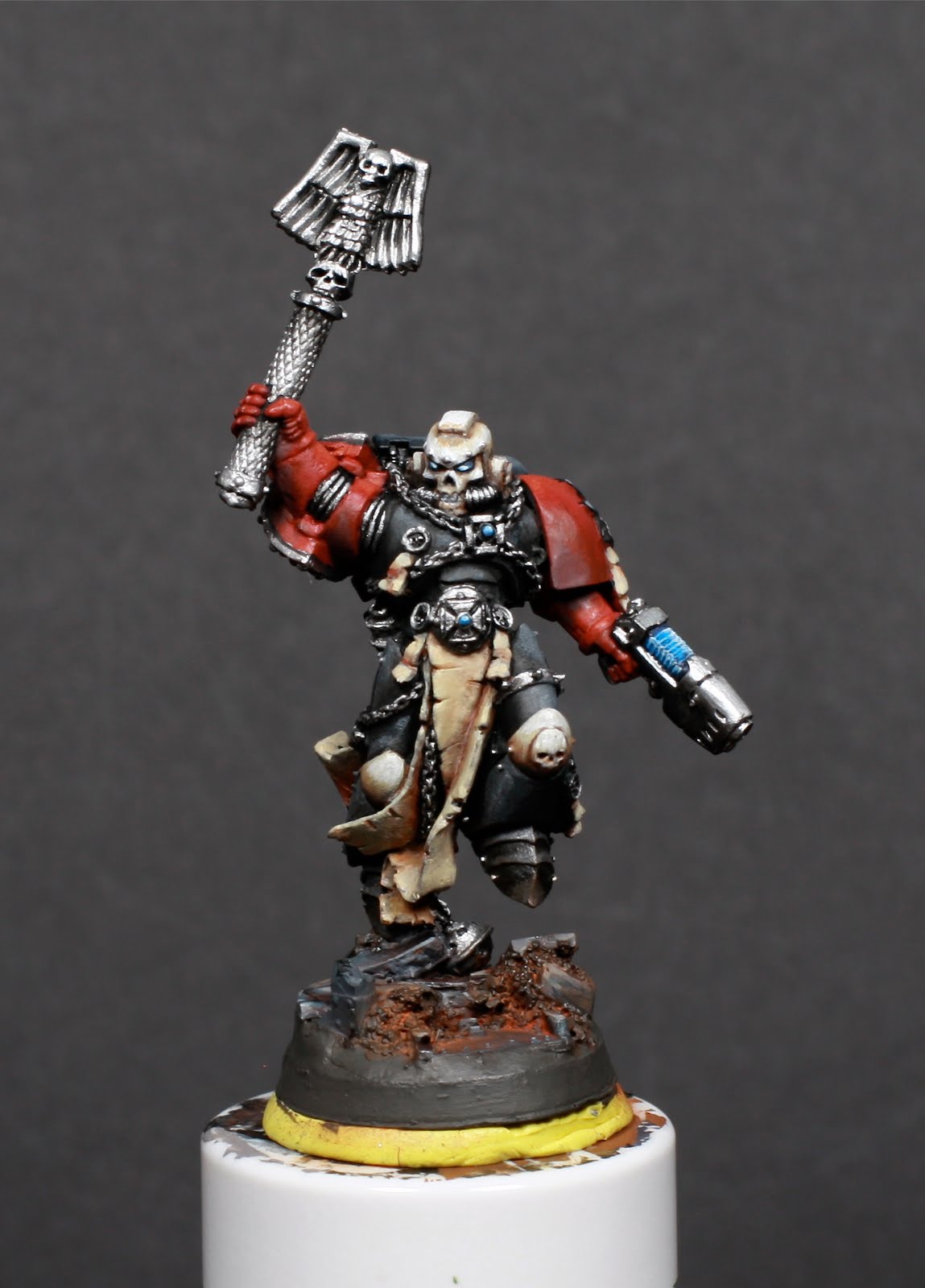
Traditionally these guys are black with red arms and shoulders. However, after some research on B&C they do follow traditional codex markings, which gave me the license to trim out the shoulders. I also added the trim color to the chest eagle and knee pads. The eagle because I think a black eagle on black armor would look pretty dull and the knee pads so I've have contrast for squad numbers (since I'm going to really geek out and number all my guys).

For the contest I was going to paint two squads from the Battleforce Box, and while I waited for that to arrive I started work on the Chaplain, which I'd had sitting in black primer for a few months. I gave him a plasma pistol, and since the Chaplain shoulder pad on this model is so huge I replaced with with a Terminator shoulder pad from the Black Templar upgrade set. A normal Marine shoulder pad looked much too small compared to the other shoulder and the BT shoulder had a suitable amount of decoration to match the rest of this guy.
When I started on him, I painted his arms and shoulders red without even thinking that a Chaplain would be all black. Ooops! Well, I really wanted to try some red, so I came up with a story (crappy fluff justification) why he's got red shoulders.

I didn't really get a good picture of the red, but this is a Mechrite Red base coat to cover the black and then I blended the shadows down to Vallejo Dark Fleshtone, which is a nice, dark red with a lot of brown in it. The highlights are an old pot of Go Fasta Red (with a tiny bit of orange), which has a little sheen to it. The nice part about this combination is that the highlights are a little more glossy and the shadows a little more matte, which is something that is repeated on the metallics.
The backpack is pretty mediocre. I had a nicer one painted, but I spilled superglue all over it when I went to glue on the magnet and had to come up with a quick replacement. Colors here are just Chaos Black and Adeptus Battlegrey.


The base was a quickie combination of greys and blues I had on my palette after painting the backpack and plasma pistol. I stippled some Calthan Brown on the rubble areas and put on some rust pigment to match the rest of the models I'd based with all rust pigments.


You can see I also made use of the red-brown Vallejo color on the parchment and kneepads, to help tie the whole thing together. I feel like the parchment needs more highlights, but I'm saving that for after I put down the freehand text and script.


Here's a decent shot of the metallics on the pistol. I used the formula for Non-Metal Metallics with Metallic Paints (or whatever craziness they call it) taught by Fontaine in his Adepticon class. I'm not sure why, but using his blending technique for Chaos Black over Boltgun is much harder for me to get smooth than using two normal colors. It seems like the consistency of the black is much harder to get right on the metallic surface.
As you can see, the bottom of the pistol is pure, matte Chaos Black. Like the reds, it gives a nice contrast between glossy and matte in the shadowed areas. The top is highlighted Mithril Silver (visible more in the top photo). I'm thinking of adding some very small highlights of pure white, since I don't see a lot of contrast between the Mithril and Boltgun. It looks like I also need to add some shadow to the bottom of the pistol grip.
You can also see a little more of the shadows and highlights on the red.


The Crozius needs some more work. I got a little better at working with the Chaos Black over the metallic, but while I originally wanted a nice monochrome Crozius, now I think it needs a little extra color. Maybe some blue, to tie to the plasma and the base, or maybe pick up the brown again to give it a little more earthy feel. A little chunky red gore couldn't hurt either.
So that's it for now; back to the painting bench for him!


0 comments: